
One slide, three images: the content slideshow picks the right one
Pull request #1761 gives the slides of the content slideshow alternative images for phones and tablets, with the presets of the theme or a width in pixels.
A wide banner works on a desktop and gets lost on a phone: the middle stays, the sides do not, and the words that sat on the right end up outside the screen. Whoever did not want one photo cropped for every screen built two blocks, one for the computer and one for the phone, or let the same image be cut. The content slideshow now takes more than one image in a slide, each one with its own breakpoint.
What it adds
The slides with alternative images are those of the content slideshow, so CMS pages, CMS blocks and the descriptions of products and categories. Open the slide, click Add mobile image, pick the photo in the media library and set the Breakpoint: a preset of the theme, Mobile or Tablet, or a width in pixels typed by hand, 900 for instance.
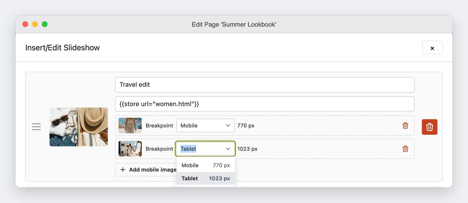
The breakpoint is the widest screen that shows that image. A slide can have more than one, one for Mobile and one for Tablet for example, and two images of the same slide cannot have the same width: the dialog refuses the value and stays open with a message. On save the editor puts the narrowest width first, because the browser uses the first image that matches the screen.
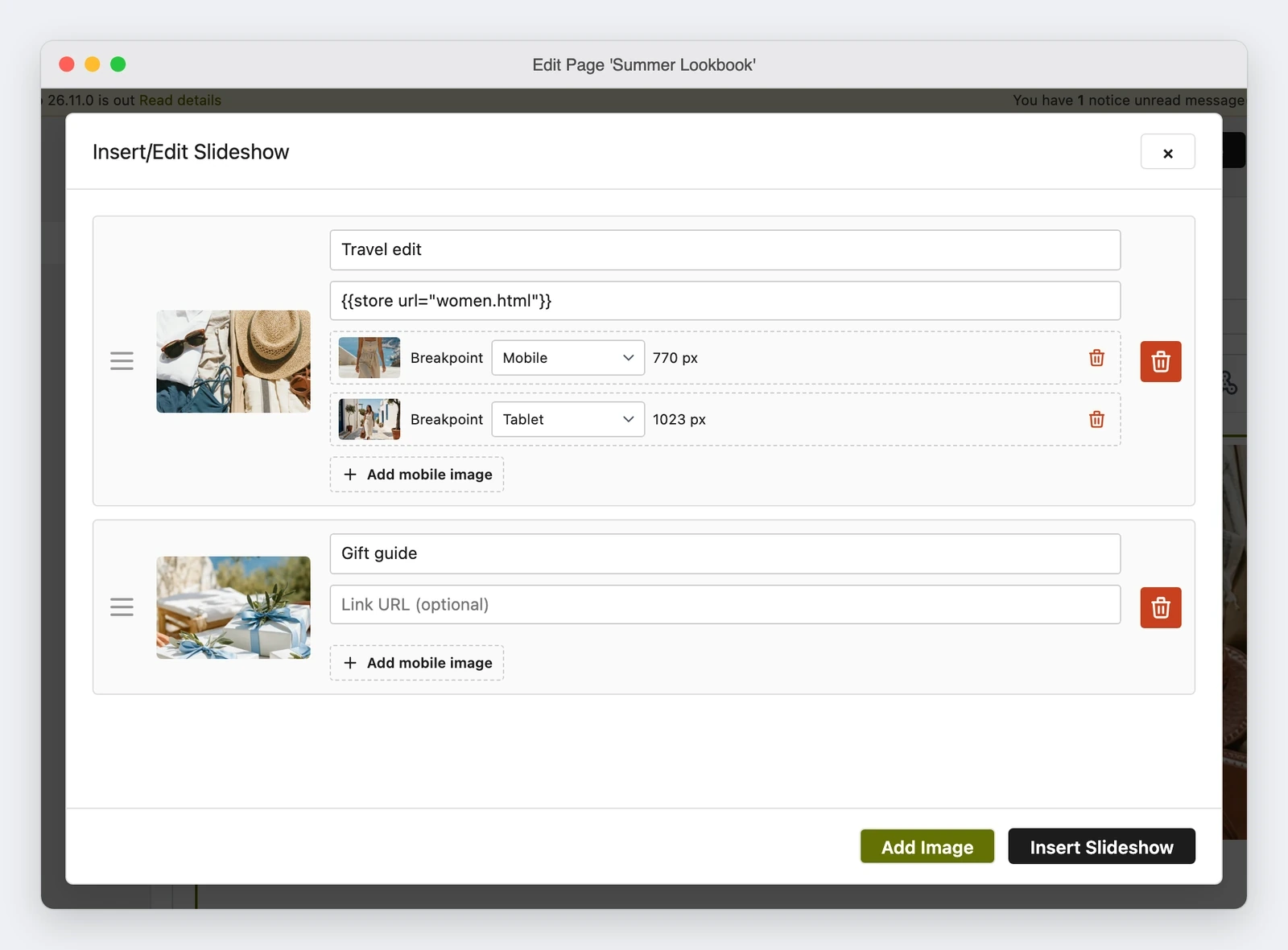
A preset follows the theme: the field shows the width the theme gives it, 770 px for Mobile and 1023 px for Tablet with the Maho theme and the industry themes, 770 and 979 with Legacy. When the theme changes a width, every slide moves with it without an edit of the content. A width typed by hand stays that width, also when the theme changes.
A slide with alternative images becomes a <picture>: one <source> with its media for each
image, and the default image in the <img>. A preset is written as a directive, and the store
replaces it with the width of the theme when it shows the page.
<picture>
    <source media="{{breakpoint code=mobile}}" srcset="{{media url="wysiwyg/banner-mobile.jpg"}}">
    <source media="(max-width: 900px)" srcset="{{media url="wysiwyg/banner-tablet.jpg"}}">
    <img src="{{media url="wysiwyg/banner.jpg"}}" alt="Summer sale">
</picture>
A slide without alternative images keeps the plain <img>: content that is already saved is
written back unchanged, with no <picture> added.
Why it matters
The first effect is that one block goes out instead of two. The second is the photo: the tall image
for the phone is no longer the same banner cropped, because inside the <picture> the image keeps
its own ratio and is not cut to a single shape, also in a slide with a fixed height. A slide with
only the <img> fills the space as it did before.
The third effect is the alignment. The presets are the widths where the theme changes its layout, so a slide changes image together with the grid, not one pixel earlier or later. To get there the pull request fixed the widths of the themes, which did not always agree: on a three-column page the right column moves below the content up to 1023 px with the Maho theme and up to 979 px with Legacy, while before it moved at 1000 px with both, and the image of a blog post changes at 770 px instead of 768.
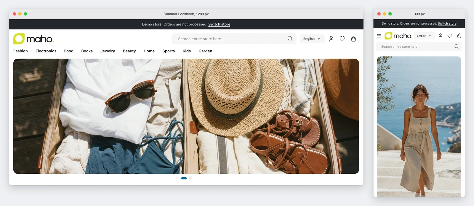
On the browser side there is no extra work: with the <picture> it downloads the image it needs and
skips the others, so the large photo for the computer adds no weight to a visit from a phone.
Three sizes in the shop window: the browser walks in and takes the one that fits.
What it needs
Nothing to install, no command to run and no module to turn on. The presets live in the
configuration of the theme, not in the admin: a theme of your own takes the widths of its parent
theme, and a theme developer can change them in the theme.xml, as the chapter on breakpoints in
the theme developer guide in the repository explains. The dialog takes the presets from the preview
store, so in a store with several store views the field shows the widths of the one it uses.
What can still change
- The editor accepts as a breakpoint a preset or one
(max-width: ...px). A<source>written in another form is removed after a warning, because writing it again would change what the browser reads. - The order of the images is set when the slideshow is saved. If the theme later moves a preset past a width typed by hand in the same slide, the order stays wrong until someone opens the slideshow again and clicks Insert Slideshow.
- When a page or a block shows in store views with different themes, a width typed by hand can sit on a different side of a preset in each store view, and no order is right for all of them. In that case the guide suggests presets only or widths only, or one page for each store view.
- The admin console logs
Failed parsing 'srcset' attribute valuefor asrcsetthat holds the directive. It is a warning from the browser, not an error: the editor keeps the attribute as written and the storefront resolves it.
A second change landed on the same slides afterwards, merged on 12 November with pull request #1813: the first image of the slideshow loads with a high priority and the others load later. It is separate work and it does not change how the breakpoints behave.
Status
This is the picture on 15 November 2026: 23 commits, 33 files, 1,139 lines added and 101 removed.
The pull request is merged into main on 9 November 2026 and is not in a published release yet:
the milestone that is open is 27.1.0. It carries the ✨ ai-assisted label, which in the repository
marks work done with the help of a model.
The pull request comes from the GitHub account empiricompany of MageMEGA, and it is merged into
the Maho core. Whoever wants to follow the branch finds it on
github.com/MahoCommerce/maho/pull/1761.
Text prepared with the help of AI and checked against the source before publication. It can still contain mistakes: if you find one, report it.Read the manifesto
Source: MahoCommerce/maho#1761
Does your store still sell?
Tell us where you are starting from: we reply with a first assessment, no strings attached.
Ask for the store assessment