
How the store looks: choosing a theme and changing it from the admin
Since 26.9 the storefront ships eleven ready themes and a Theme Settings panel that changes colors, fonts and shapes without a file.
Since the storefront was rebuilt in 26.9.0, on 17 September 2026, changing how the store looks no longer means asking somebody to edit a stylesheet. There are eleven ready themes and a panel, Theme Settings, that changes colors, fonts and shapes from the admin, with the preview in front of you. This article is about what you can do yourself, without writing code; at the end there is the point where a developer takes over, with the right article to read.
Eleven themes, one per kind of shop
Every installation starts with the neutral theme, built to sit well with any catalog. Above it there are ten industry themes: fashion, electronics, food, books, jewelry, beauty, home, sports, kids and garden. Each one is a finished storefront with its own type, palette and rhythm, not a colour variant of the same design.
All of them ship a light and dark version except food and kids, on purpose. And all of them run on the same catalog, the same checkout and the same admin: choosing a theme does not change what the store can do, only how it shows it.
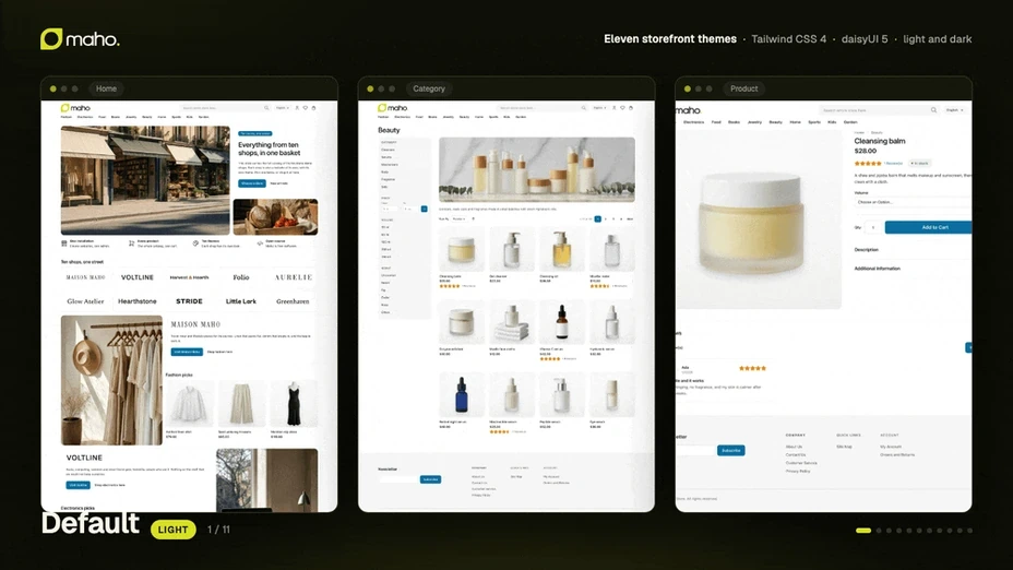
Choosing the theme
The active theme is set in System > Configuration > Design, where you fill Package and Theme, and then you flush the cache. It is a scoped setting, so two store views of the same store can carry different themes: the fashion theme on the main site and the home theme on a brand store, for example.
If the store comes from a version before 26.9 and nobody had ever picked a package, the upgrade
selects the legacy package by itself and the store keeps the look it had. No surprises on the first
page load.
Theme Settings: what you can change without a file
This is the part that used to need a developer. Under System > Configuration > Design > Theme Settings you find the values that define the identity of the store:
- colors: primary, secondary and accent, page background, text color, review star color, footer colors;
- fonts: body and heading font, with the web font stylesheet, plus heading weight and letter spacing;
- buttons: uppercase or lowercase, and letter spacing;
- shapes and sizes: three corner radii (selectors, fields, boxes), control size, border width, raised surfaces;
- product images: the background color behind the photo;
- dark mode: the switch that decides whether the store follows the device theme;
- custom CSS: a free field for what the settings above do not cover.
Every field takes the CSS value itself, so a radius takes 999px and a font takes its family stack.
The readable color on each palette color and the two quiet surfaces behind the background are derived
by contrast, so there is no field to get wrong. An empty field changes nothing: the theme value
stands.
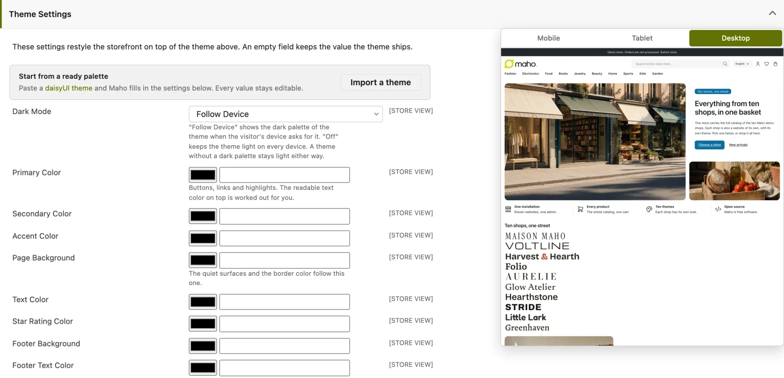
The preview on the right updates while you type and can be seen at phone, tablet and desktop width, so you notice at once when a heading wraps or a button grows too narrow. The settings apply per website or per store view, like the rest of the configuration.
If you already have a daisyUI theme
When you like a daisyUI theme, or built one with the generator, Import a daisyUI Theme takes the CSS block and fills the fields for you. It is the quickest way to start from a considered palette and then refine it by hand.
Handing it over to a developer
At some point the admin ends and the work in git begins. Two typical cases:
- you like the result and want it tracked: with
./maho dev:frontend:theme:export --theme <package>/<theme>the settings become atheme.cssto commit, and the fields are cleared because the values now come from the file; - you need something the fields do not cover, such as a CSS rule, a block moved elsewhere or a different template: that is theme work.
For the second case the article to read is Creating a Maho theme, which walks through the customisation tiers: theme values first, then CSS rules, then layout, and template copies only at the end. The rule that keeps the store upgradeable is one: override as little as possible, because every copied file has to be checked again at each Maho update.
Three practical tips
- Try it on a staging store view, not directly on the live one: Theme Settings is powerful, and a wrong palette shows at once, to everyone.
- Start from a theme close to yours, not from the neutral one: changing two colors of an industry theme costs less than rebuilding the identity.
- Look at the phone before saving: the narrow preview is the one that surprises, between headings that wrap and buttons that stretch.
With that, the look of the store is something you handle yourself, whenever you want, without opening a ticket.
Text prepared with the help of AI and checked against the source before publication. It can still contain mistakes: if you find one, report it.Read the manifesto
Source: Release 26.9.0
Does your store still sell?
Tell us where you are starting from: we reply with a first assessment, no strings attached.
Ask for the store assessment